Finding the Right Symbol
Every logo exploration began with one question: "What single symbol could represent MwanaWev's purpose?"
Rather than sketching random marks, I went back to the brand strategy and extracted tangible nouns from the discovery phase, bridge, sunrise, network, shield, tree, satellite, and lightbulb. Each represented a different aspect of the company's mission to bridge technological gaps, empower communities, and drive innovation across Africa.
From there, I explored multiple abstract directions, simplifying each concept until it could function as a memorable icon. The goal wasn't simply to create something visually appealing, but to find a symbol that could communicate progress, connection, and optimism with the fewest possible shapes.
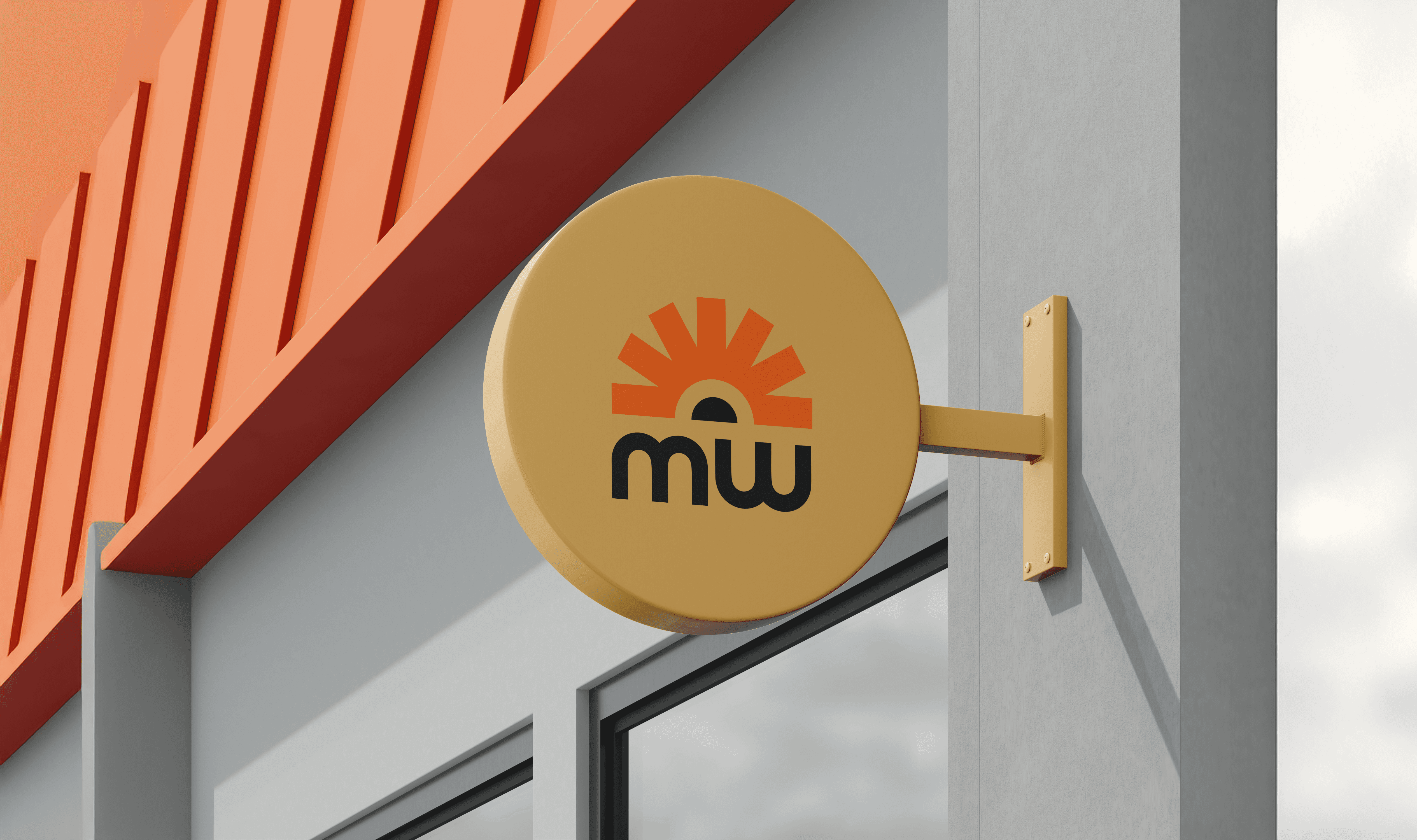
After several iterations, the sunrise concept stood out. It represented a new beginning while the radiating forms suggested both the spread of knowledge and digital connectivity, making it the strongest visual metaphor for the brand.

Building a Flexible Identity
Once the icon was selected, the focus shifted from creating a logo to building a complete visual identity.
The sunrise symbol was refined to improve its proportions, balance, and scalability. Every curve and spacing relationship was adjusted so the mark remained recognizable whether displayed as a favicon or on large-format signage.
With the icon established, I explored different lockups and combinations with the wordmark. This stage wasn't about decoration, it was about creating a system that could adapt across different applications while maintaining consistency.
Packaging and stationery mockups were introduced early to test the logo in realistic environments. Seeing the identity applied outside the artboard helped validate decisions and ensured the system felt cohesive before moving into the broader visual language.

Extending the Brand Beyond the Logo
Strong identities don't rely solely on a logo. They create recognizable visual systems.
To achieve this, I deconstructed the sunrise icon into its simplest geometric components. Instead of repeating the complete logo as a pattern, individual elements were isolated, rotated, mirrored, and combined to create new compositions.
This approach allowed the patterns to feel connected to the identity without becoming repetitive or overly literal.
Different pattern densities and colour combinations were explored to support multiple applications, from packaging and printed materials to digital assets and environmental graphics. The result is a flexible visual language that reinforces the brand while allowing individual applications to have their own character.
The identity becomes recognizable not only through its logo, but through its colours, shapes, rhythm, and repeating forms.

